The new Zen
Three new themes in three days! Today, our grand project to update and refresh all our honeymoon registry designs reaches Zen.
Much like yesterday’s update to Vintage, the new Zen hasn’t changed in an especially dramatic way. We’ve applied the colour scheme more consistently, we’ve removed some elements that were only really there to prop up the technical implementation of the previous design, and we’ve made things a little more spacious so there’s room for them to breathe.
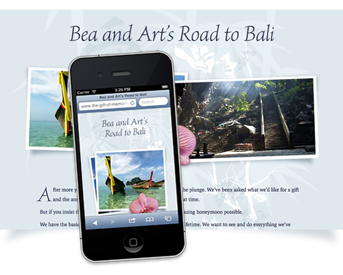
 As with all our updated themes, the new Zen works perfectly on smartphones and tablets. It’s particularly fun with this one to bring it up on an iPad, and to switch from horizontal to vertical orientation and back again. We’ve freshened up the typography and toned down our own branding, so the focus stays on you and your honeymoon plans.
Tranquil, sophisticated and romantic, Zen is perfect for honeymoons to the Far East. Here’s Bea and Art’s Road to Bali — a tour of South-East Asia, sampling the splendour of Malaysia and Singapore along the way.
If your list is currently using the previous version of Zen, we haven’t automatically switched you over — you can continue using the original theme for as long as you wish. If you’d like to see how your list looks in the new Zen, simply let us know and we’ll be glad to help.
There’s only five themes left to cover now. Next week begins with another big transformation: the new American Dreaming.