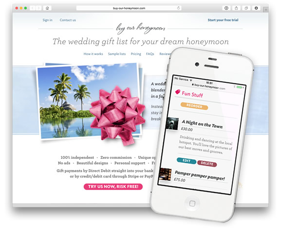
Our new design is live!
It’s been our big project of 2014 — and we’re thrilled to now be able to launch it. Our new design is a top-to-toe refresh of every part of the site, from its technical underpinnings to our choice of typefaces.
The big news is that our new site works fabulously on phones and tablets, so it’s now incredibly easy to put your list together on any device you’d like to use.
We’d made each of our registry themes responsive back in 2013, so this year we brought the same thing to our main site and list management screens. It means that you can add or amend items, check your Gift History or even edit and request your Registry Cards, regardless of whether you’re on a desktop PC or an iPhone on the bus.
We’ve also rethought and improved our FAQs page, added tons of new real customer testimonials to our reviews page, and added a brand new partnerships page. And we’ve brought this blog in-house so that it’s much better integrated into the rest of the site. There are dozens of other changes too, both big and small, while keeping the fundamentals of our service intact, and our list management screens as simple to understand, and as easy-to-use, as they’ve always been.
Excluding the site we used as the gift list for our own wedding, this is Design Three — the last time we redesigned the site was back in 2011, so version two lasted us a pretty good while in Internet Years. With this design, we’re bidding farewell to support for Internet Explorer versions 6 and 7, though IE8 and up should work perfectly. We’ve done lots of testing on many different browsers, but there’s always a chance that some glitches remain. If you find anything, we’d love to hear about it.
It’s also given us a platform for lots more work and development to come. As always, watch this space!
